CQ Fitness Co
Services
- APPLICATION
- BRAND STRATEGY
- LOGO & IDENTITY
- REBRAND
- WEBSITE
Industry
HEALTH & FITNESS
Client
CQ Fitness Co

THE CLIENT
CQ Fitness Co offers individualised gym programming, strength and conditioning, personal training, and specialised exercise-based injury management to the people of Central Queensland, empowering them to build lifestyles they are proud of.
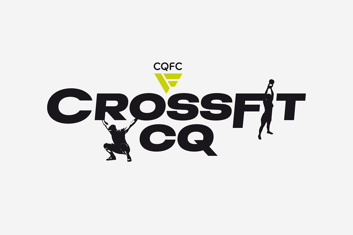
BRAND ARCHITECTURE
Formerly known as CrossFit, CQ Fitness Co expanded its services, necessitating the creation of a distinct parent brand to unify its various subsidiaries. An endorsed brand architecture structure was developed to ensure clarity in direction and ownership, fostering a unified and coherent brand identity.
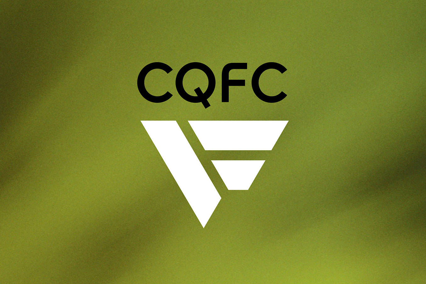
STRENGTH IN DETAIL
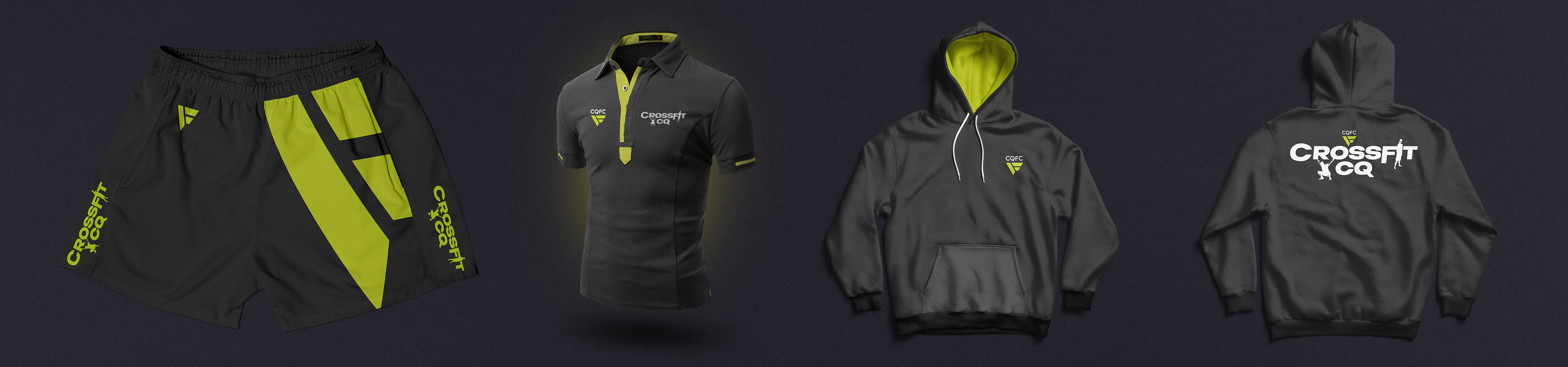
The logo, embodying dynamism, strength, and motion, was crafted to inspire individuals to strive for their optimum potential. The supporting visual identity draws on the logo shape, ensuring a seamless extension of this motivating theme.
ENHANCING BRANDS
Each brand within the CQ Fitness Co family underwent a refresh to align with the contemporary aesthetics of the new parent brand. This transformation adhered to an endorsed brand architecture structure, ensuring a cohesive and harmonised visual identity across the entire brand portfolio.